Mexico City Design Firm WTF Arquitectos walks us through designing a memorable workspace for client Red Bull México.
The Red Bull México office project is in one of the most iconic buildings in Mexico City, occupying a free-plan space of 600m². Upon studying the brand, it was discovered that Red Bull embodies diversity, attracting athletes and artists who identify with a wide range of values and emotions. However, a single word ties them all together: CHALLENGE. This concept became the foundation for the design approach, aimed at consolidating a vibrant community where every user feels deeply connected to the Red Bull spirit.

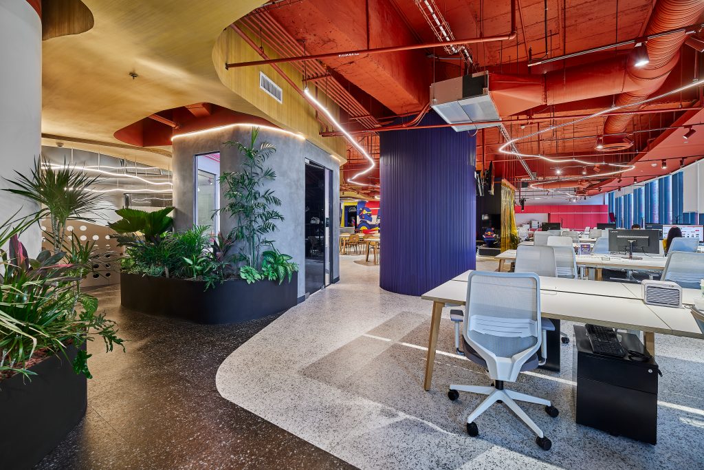
The open floor plan allows users to take in the entire space, creating a journey of discovery where every step reveals a memorable experience or activity.
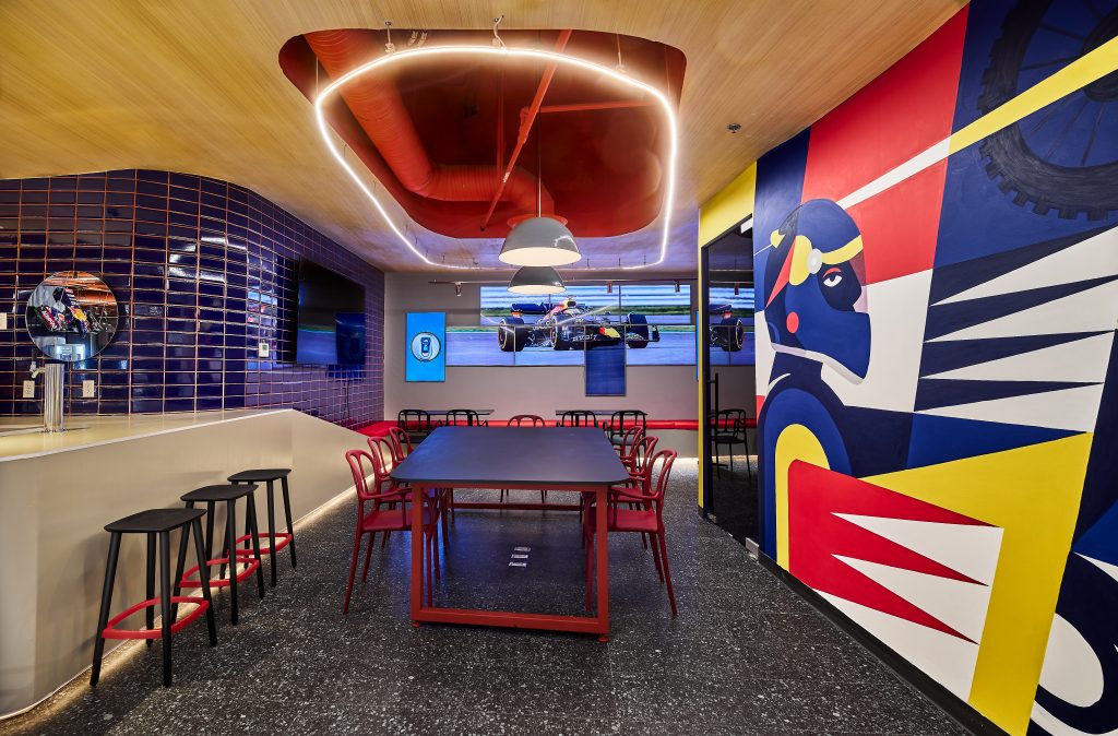
The multifunctional nature of the spaces ensures fluidity in use; for example, the reception area can transform into a DJ booth, seamlessly connecting to the bar-dining area, which gently branches out into the rest of the office.
The overarching concept of “giving wings to people through ideas” is at the heart of the design.
First Impressions
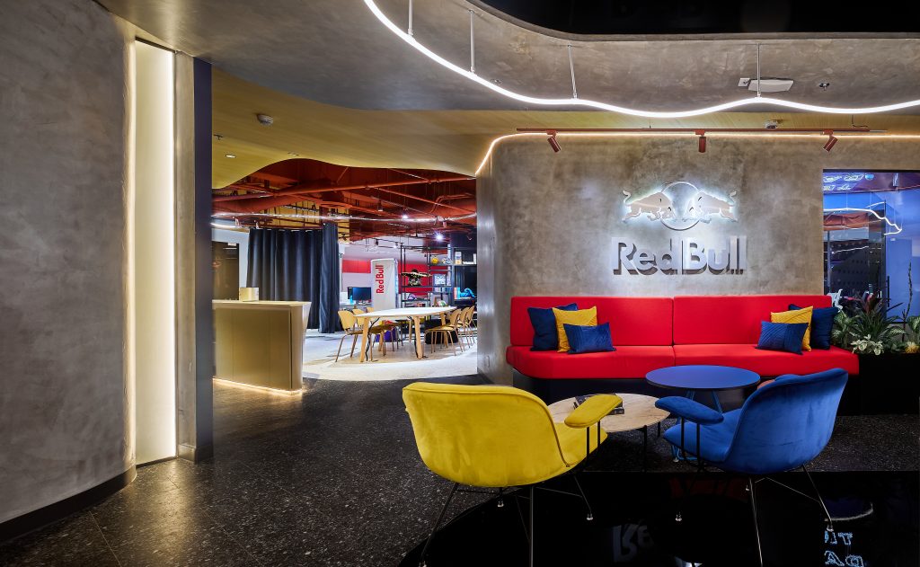
Inspired by a cenote, the reception features reflective elements that symbolize water and sky. These mirrors allow users to see themselves immersed in the brand, with the iconic Red Bull logo prominently displayed. The journey culminates with a rear lattice structure inspired by the negative space of a climbing wall, reinforcing the brand’s adventurous essence.

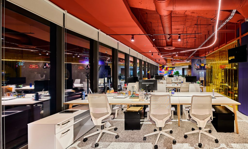
The material palette includes concrete-finished walls and ceilings designed to draw the eye upward. A standout feature is the curved wooden ceiling, reminiscent of a Skate Park, accentuated by 360-degree LED lighting to emulate elements of urban culture. We also embraced the terracotta color, iconic in Mexico, using it for the slab, installations, and luminaires to integrate harmoniously with the overall aesthetic.
Each meeting room incorporates unique design elements. In one particular space, we transformed the Red Bull can into an architectural feature, suspending around 1,000 cans to create a striking ceiling installation that also serves acoustic purposes. The flooring consists of terrazzo-like rubber with rug accents to evoke a more residential, communal feel, moving away from traditional office design toward a community-focused environment.
By moving beyond the conventional office layout and embracing the concept of “challenge,” we created an architectural program that allows users to transform and interact with each space differently. Alongside formal work areas, the design includes dynamic recreational spaces that foster a new sense of belonging—the Red Bull community.

Project Planning
The planning of the Red Bull México Offices involved active participation from both the c-suite and employees. Leadership from the c-suite provided essential input on the overarching goals of the office, emphasizing the importance of reinforcing Red Bull’s culture of challenge and creativity in every space. They were closely involved in aligning the design with the brand’s image of dynamism, innovation, and community.

In addition to leadership involvement, employees were engaged through pre-planning surveys and change management activities. These surveys provided insight into employee preferences and work habits, ensuring that the design reflected the needs and desires of those who would be using the space daily. Employees’ feedback played a crucial role in shaping the multifunctional layout, with spaces that could adapt to different uses throughout the day. The aim was to create an environment where work, creativity, and recreation coexisted harmoniously, fostering a strong sense of community.

One of the unique design challenges of the project was translating Red Bull’s identity into architectural elements. Extensive research was conducted to understand the core elements of the brand, particularly its association with challenge, adventure, and diversity. This led to the creation of spaces that evoke memorable experiences, such as the cenote-inspired reception area and the ceiling installation made from around 1,000 Red Bull cans, designed to enhance acoustics. The integration of Mexican cultural elements, like the terracotta color scheme and materials reminiscent of traditional villages, required additional research to ensure these details were not only aesthetic but also meaningful to the brand and the local context.

The project demanded careful coordination between multiple disciplines, including architecture, lighting design, and furniture suppliers, ensuring that each element worked together to create a cohesive and immersive experience that embodies Red Bull’s daring spirit.

Project Details
The Red Bull México Offices were designed with health and wellness at the forefront, creating a space that not only promotes productivity but also prioritizes employee well-being. The open layout encourages movement, while multifunctional areas like the bar-dining space and recreational zones offer moments of relaxation and social interaction. Natural materials, such as the curved wooden ceiling inspired by a Skate Park, and a terracotta color palette, harmonize with the space to evoke warmth and a connection to nature, enhancing mental well-being. Additionally, the integration of reflective surfaces in the reception area fosters a sense of openness and calm.

Branding elements are deeply embedded in the design, ensuring that the spirit of Red Bull is felt throughout the office. The reception, inspired by a cenote, symbolizes Red Bull’s connection to adventure and exploration, while the use of the brand’s iconic can in the boardroom ceiling is a literal and artistic representation of its identity. The design reflects the company’s core values of challenge, diversity, and innovation, with each space crafted to inspire creativity and a sense of belonging to the Red Bull community.

Among the most unique features are the multifunctional spaces, where the reception can transform into a DJ booth for events, and the architectural ceiling in the boardroom, made of approximately 1,000 Red Bull cans, serves as both a visual statement and an acoustic solution. The natural wood ceiling, curved like a Skate Park, is another standout feature, providing both a functional and artistic element that elevates the overall design. These details, along with the careful selection of furniture and finishes, make the space an innovative and vibrant environment where work and play blend seamlessly.

Products

Overall Project Results
The overall project results for the Red Bull México Offices showcased a dynamic transformation for both the space and its users. One of the key challenges during the change management process was aligning the brand’s adventurous, high-energy identity with the daily needs of the employees, while introducing a non-traditional, flexible office design. Employees were initially apprehensive about adapting to an environment that encouraged more freedom, creativity, and multifunctional use of spaces. To overcome this, we implemented engagement activities that allowed employees to interact with and experience the design concepts early on. This proactive approach helped foster excitement and eased the transition.

Post-occupancy surveys reflected high levels of satisfaction, with employees expressing how the space not only met their functional needs but also enhanced their connection to the Red Bull brand. The most illuminating result was the reciprocal transformation between the users and the architecture. Employees didn’t just adapt to the new space; they actively appropriated it, using the multifunctional areas creatively in ways that exceeded our expectations. Similarly, the architecture adapted to its users, providing a platform where employees could embrace the brand’s ethos of challenge and innovation.
Ultimately, the project proved that when a design truly reflects the brand and empowers its users, it creates an environment where architecture and the people within it mutually transform each other, reinforcing Red Bull’s vibrant community spirit.

Contributors:
Salvador Munca (Murals)

Design Team
Nico Salto del Giorgio
Sinuhé Vera Montes de Oca
Photography
Arely Medina Q Photo


