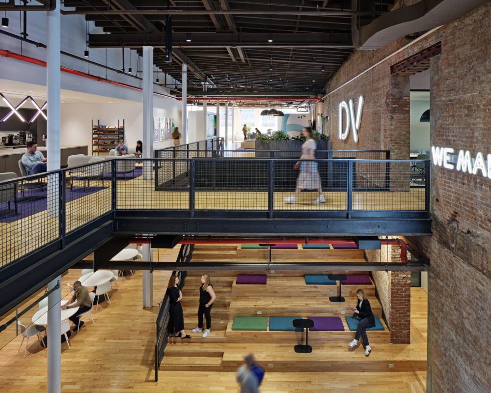
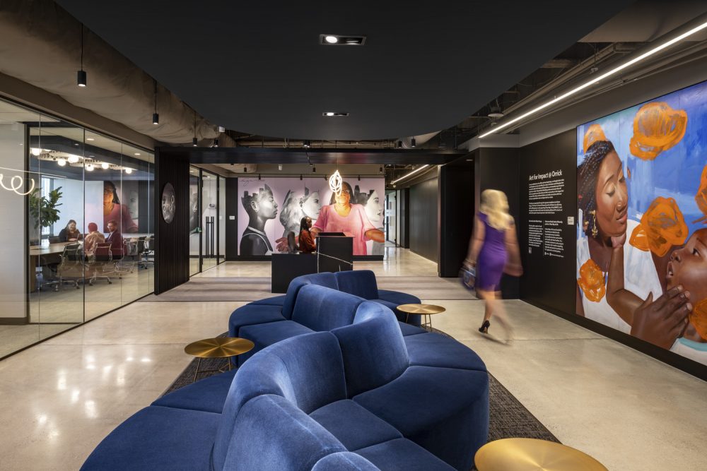
Unispace’s Albert DePlazaola outlines the five keys to success for an innovative hybrid workplace.
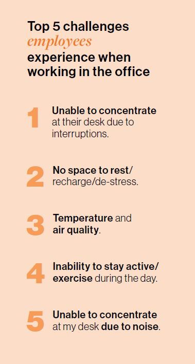 A key data point from Unispace’s recent Global Workplace Insights Survey, From Restrictions to Resilience, could be a harbinger for the future of workplace design. According to our report, employers are less confident this year (76%) than in 2023 (81%) that their workplace enables employees to be innovative.
Work practices and habits have changed. While employees report wanting to come to the office for effective collaboration and focus, open-plan office designs provide little to no reprieve from distraction or noise, which can make both meetings and heads-down work a hassle. It’s like expecting a soccer team to play their best game on a softball field: without the right environment, you’re setting them up for failure.
The post-COVID office isn’t just competing with a home office; it’s competing with the comforts and benefits of working from home. A successful hybrid office model must deliver on the promise that employees can be more productive in the workplace than at home.
To do this, we must be more intentional about design. Here are a few principles that emerged from our latest research.
1. Stop the Obsession with Benchmarking
Benchmarking is the quickest path to mediocrity
– Frank Duffy, pioneer of workplace strategy and founding partner of the firm DEGW.
Duffy’s words have never been more relevant. Post pandemic, organizations are increasingly experiencing decision paralysis, requiring more benchmarking data to justify expenditure based on market signals that may not be relevant or useful. Now more than ever, companies are clinging to arbitrary RTO policies, desk-sharing ratios, and space guidelines, which very well may be idiosyncratic to their actual needs.
There is no “average” organization to reference, and no perfect solutions to cut across all market sectors. Employees do not experience “averages” or “benchmarks,” they respond to how well the workplace supports their needs. If iPhones depended on benchmark data for production, we’d all still be using BlackBerrys.
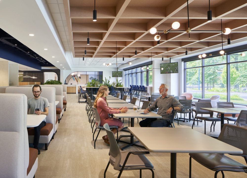
2. Design for Performance, Not Perception
Given the diminishing confidence from employers on the ability of their current office environments to drive innovation and nurture productivity, designing spaces that cater to worker needs is top of mind for many companies. The fact is innovation thrives when the workplace adapts to new demands. Our research points to key workplace drivers that boost performance:
- Adaptability: Spaces should be future-proof, ready for growth and flexible enough to accommodate hybrid work rhythms. This can be achieved through providing spaces that can change use through a rearrangement of furniture or a change of space etiquette. A huddle room and a day office are typically the same size and use similar furniture. Based on demand, the use of this room can change by listing it differently on a reservation system.
- Well-being: Prioritize mental, physical, and social wellbeing to reduce stress and promote positivity. Natural light, outdoor space, relaxation rooms and greenery, are now expectations. Next generation wellness includes: Wearable health monitoring technologies that communicate with building systems such as lighting, soundscapes and temperature that automatically adjust to individual preferences, VR/AR relaxation experiences, “Walk and talk” phone booths (small walking tracks with acoustic privacy) and AI-powered digital nudges to promote movement.
- Enablement: Provide resources and environments that give employees the tools to be productive and creative, particularly for individual and smaller teamwork, providing specific zones (not team neighborhoods) for both.
- Connection: Facilitate relationship-building and knowledge-sharing among teams to inspire innovation. Simple design techniques such “Campfire” configurations – circular seating with individual power/data go a long way.
- Authenticity: Ensure the workplace reflects the company’s culture, values, and brand to engage employees deeply. The survey found that 79% of employees from the ages of 18-54 would be happier to spend more time in an office if the workspace connected them to the organization’s brand, culture and values.
3. Move on from Open Neighborhood Plans
The predominant organizing design principle for office space is the “neighborhoods” model, whereby teams or groups have designated work areas with workstations, conference rooms, and phone booths. When executed well, this model can be effective. But when the goal is to maximize “butts in seats,” neighborhoods morph into a sea of open workstations that neither support teamwork, nor focus.
Furthermore, our research, along with nearly every metric set in the industry, indicates that employees want to come into the office with intention, to complete discrete tasks and socialize/reconnect with fellow employees. They are coming in with a goal in mind, not to sit in an open workstation with a headset and score presenteeism points—behavior which is neither productive, nor innovative.
4. Do Not Conflate Aesthetics for Strategy
A truly great workplace is predicated on thoughtful space allocation and zoning strategies with commensurate attention to the look and feel of the office. However, practitioners often leapfrog from test fit to a “Furniture, Fixtures, and Equipment” (FFE) package, and an effective workplace strategy needs to be about more than just aesthetics.
From the early 2000s until today, tech firms from Menlo Park to Park Slope have used a natural wood juxtaposed against pops of colorful branded environmental graphics and intentionally cracked concrete snack bar countertops covered with curated snacks of dried fruit and gluten-free granola. These are aesthetics and policy decisions that make a good workplace strategy great.
However, the look, feel, or FFE selections of a workplace should not be confused with intentional design decisions and interventions that encourage human behavior. They are interrelated but not the same. Barcelona and Eames chairs alone are not going to bring droves of suburbanites with hour-long commutes back to the office to innovate.
In addition, many firms are now minimizing real estate costs, as occupancy patterns fluctuate and employee needs shift. While landlords may provide tenant improvement (TI) allowances to boost tenant retention, these incentives typically range from $70–150 a square foot—allowing for little more than minor upgrades, i.e. paint and carpet.
However, modest budgets can still influence how, what and why humans consume. Retail brands such as Ikea, Zara, and Target—now carrying Michael Graves tea kettles—have found ways to employ good design at relatively low-cost points. Durability may be an issue, but with leases rarely extending beyond 5 to 7 years, perhaps we should take an H&M fashion cycle approach to workplace design.

5. Invest in Technology and Model Behavior
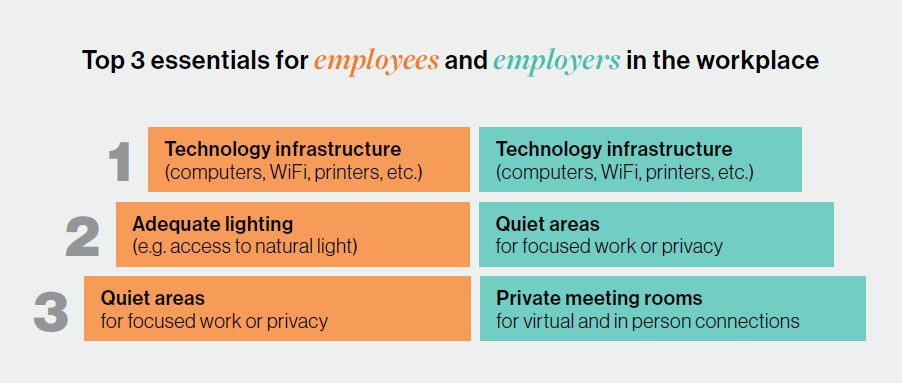
Spending coveted resources on premium mohair carpet tiles—no matter how intrinsic they may be to the overall color palette—pales in comparison to providing consistent and reliable technology that works. As we enter our fifth year of regular video meetings, spending the first five minutes asking, “Can you hear me?” or searching frantically for the right dongle should no longer be the initial salutation for Zoom or Teams calls. Employers that ensure their offices are set up for hybrid meetings—with fast Wi-Fi, easy access to private meeting rooms, simple screen sharing connectivity and reliable sound quality—already have a serious leg up against organizations that haven’t made an investment in dependable tech.
Innovation in the workplace starts with leadership. If we believe that employees tend to mimic leadership behaviors—and significant research indicates they do—it’s time to pull executives out of Aspen and La Jolla and bring them back into the office. Leverage leadership’s cultural capital to promote interaction, teamwork and concentrative work, at no additional design cost.

