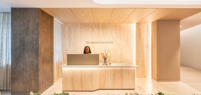
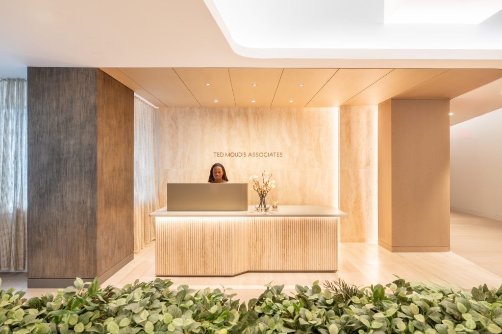
Ted Moudis Associates walks us through designing their own space at the iconic Chrysler Building in New York City.
Project Overview:
- Design Firm: Ted Moudis Associates
- Average Population: 85
- Completion Date: September 2024
- Location: New York, New York, USA
- Size: 23,000 RSF
- Types of Amenity Spaces: Cafe, Mother’s Room, Lounge, Private Phone Rooms, Multiple Conference Rooms & Open Collaboration Space
- Firm’s Areas of Expertise: Architecture and Interior Design
- TMA made the decision to make its new home a full floor in NYC’s iconic Chrysler Building. As interior designers, we are accustomed to designing for our clients, but creating a space for ourselves presented a unique and exciting challenge.
- We found ourselves asking the same questions our clients often do: What is the future of the office? In a post-COVID world, what role does the physical office play? How can we make it a place where staff not only need to be, but want to be?
- After much consideration, we determined that the space had to be experiential above all else. We also reconsidered the traditional ‘architect’s office’ aesthetic—why do so many design firms look alike?
Could we create an amenity-rich workplace, designed with the same thoughtfulness and care that we would provide for our clients?
These questions became the foundation for all of our design decisions.
We wanted to create an environment that encourages meaningful connections among colleagues and fosters a strong sense of community, grounding everyone in the TMA organization. Above all, we prioritized the staff experience, recognizing its central role in making the office not just functional, but truly inviting and inspiring.
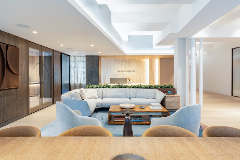
In doing so, we aimed to break away from the conventional expectations of what an architect’s office should look like, while still maintaining the essence of a design firm. We challenged the use of traditional materials, recognizing that many had grown accustomed to the comfort and relaxation of working from home. We sought to bring that same sense of ease and warmth into the workplace, designing a welcoming, immersive space that would support our work, reduce stress, and make both staff and guests feel valued and comfortable in the environment

Design Process & Planning
The planning process for the project involved the entire office, from the owner to the mail room personnel—everyone had a voice. It was crucial to us that all opinions were considered so that any potential issues could be addressed early on. The process began with focus groups where each studio shared their “wish lists” and “don’t replicate lists.” Additional focus groups were held, grouped by responsibilities to ensure we captured the specific needs of each role. All of this feedback was then synthesized into a cohesive plan by our workplace strategy team, ensuring that every perspective was incorporated into the final design.
Preplanning Exercises
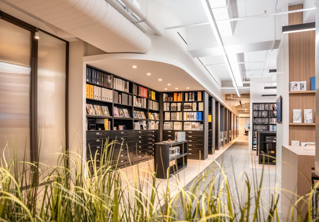
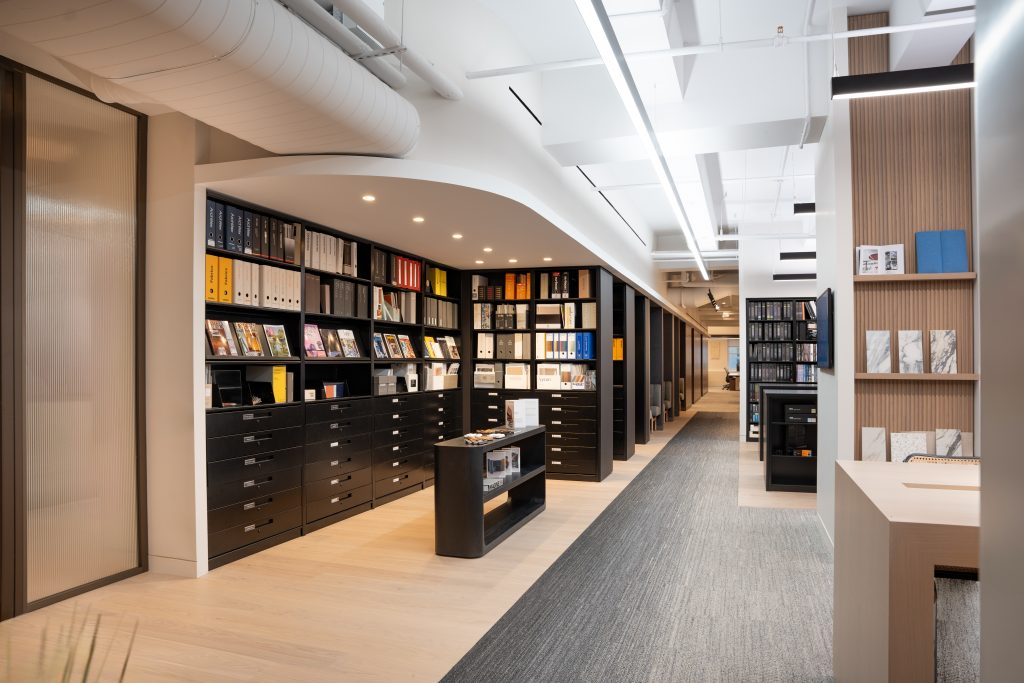
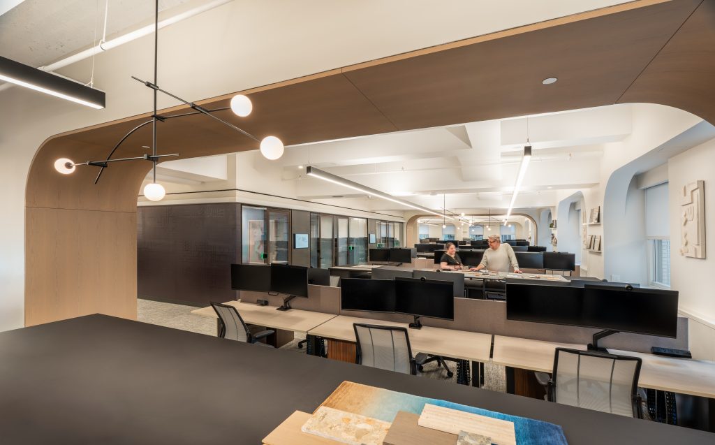
As part of the preplanning process, we conducted several exercises to ensure the design would meet the diverse needs of the staff. We started by creating mockups of the storage islands, allowing the team to assess factors such as comfort during standing work, the island’s height as seen on camera during Zoom calls, the level of privacy between desks, and the overall storage capacity. Additionally, a wide range of new mobile storage units was distributed to staff members. This enabled both designers and managers to experiment with various options for storing materials, ultimately determining the most efficient products for the team’s day-to-day needs.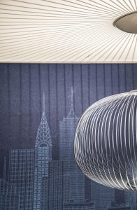
We also developed mockups of the new desking system and storage islands to ensure comfort with aisle clearances, desk sizes, and the height of the storage units. This hands-on testing allowed staff to confirm that the workspace layout was both functional and comfortable. Following this, we conducted a thorough review of existing storage practices and considered new protocols for maintaining documents and samples. This exercise helped us rethink the system to improve organization and efficiency.
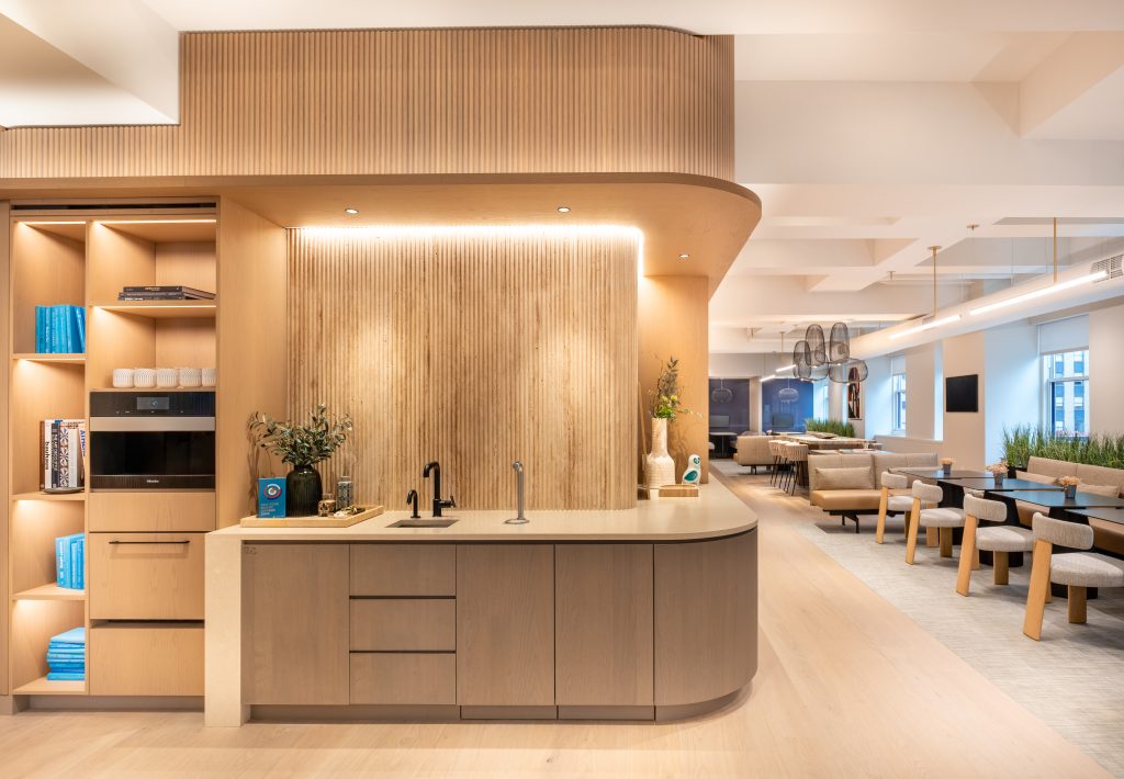
Sustainability was a key focus in the café’s design. We explored the impact of using reusable mugs instead of disposable cups, including the implications for storage capacity, dishwasher needs, and operational changes. Additionally, we considered the use of water pitchers in place of disposable bottled water for guests, ensuring the design supported a more eco-friendly approach. These exercises played a crucial role in shaping the functionality and sustainability of the space.
Engagement Activities
Extensive furniture showroom visits allowed staff to touch, feel, and sit on every specified item, ensuring that the details and finishes met our standards for both aesthetics and comfort.
Additionally, we visited the installation of the IAP folding wall system to review its ease of use, appearance, acoustic performance, and overall functionality. This visit included participation from owners, designers, managers and operations staff to gather a comprehensive range of feedback. Visits to appliance showrooms were also conducted to get a firsthand look at the functionality and details of appliances such as espresso machines and refrigerators, ensuring they would meet the needs of the office. These activities played a critical role in shaping the final design and ensuring it aligned with both practical and experiential goals.
Standout Details
Health and Wellness
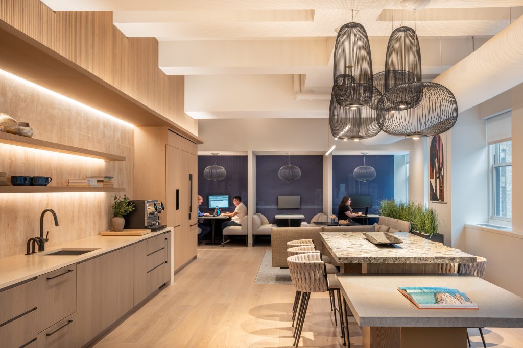
To promote employee well-being, we implemented a variety of design strategies aimed at supporting emotional, mental and physical health. A subtle and sophisticated biophilic design strategy was woven throughout the space to reduce stress, improve mood, and foster a sense of connection to nature. This approach focused on the use of natural textures and materials, calming indirect lighting, and maximizing access to daylight for all staff. Spaces were designed to recreate experiences found in nature, such as “prospect and refuge,” which can be seen in the various booth seating and private focus rooms. These areas provide employees with both comfort and a sense of security, helping to enhance emotional and mental health.
A variety of alternative work settings were created, ranging from individual focus rooms to communal tables. These options allow employees to find privacy or connection when needed, or simply enjoy a change of scenery. Offering multiple work settings gives staff autonomy and choice, improving personal comfort and contributing to satisfaction, mental well-being, and productivity. In the open workspace, a sound masking system was installed to reduce distractions and provide a comfortable environment, while automated shading helps prevent glare and solar heat gain to further enhance comfort.

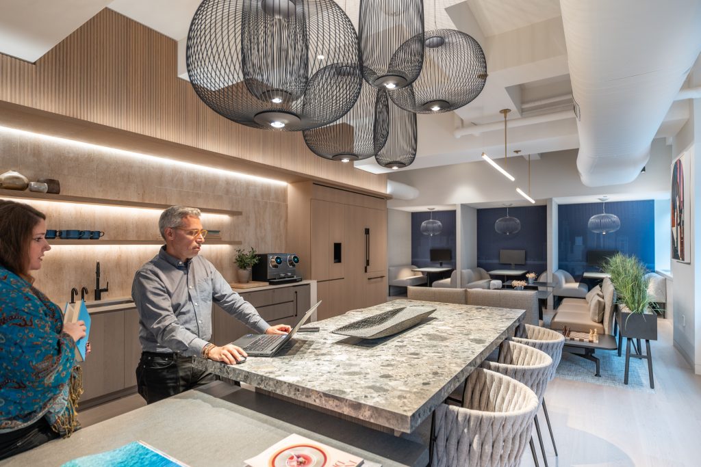
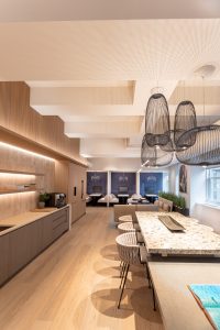
To support physical health, height-adjustable desks were provided to all employees, and a selection of healthy snacks, including fresh fruit, is offered daily. The café was also designed with the main circulation path running through it, encouraging staff to traverse the floor and engage with the space, even if only in passing. For convenience and cleanliness, the café includes hands-free faucets and soap dispensers, as well as a no-touch ice dispenser.
Lighting controls within the work booths allow staff to adjust the lighting based on their tasks or mood, giving them more control over their environment. Phone rooms are equipped with adjustable sconces that can be adapted for working or Zoom calls, providing a soft glow for added comfort. Double-glazed glass partitions in meeting rooms ensure full acoustic privacy, while fully enclosed meeting rooms without glass offer both visual and acoustic privacy for more personal and confidential meetings, supporting the neurodiversity of different working styles among staff.
Artwork, including a variety of textures, fiber art, sculptures, and calming color tones, was strategically used throughout the space to promote mental wellness.
The wellness room offers a soothing environment for staff to rest, meditate, or support new mothers, featuring comfortable swivel chairs, soft neutral tones, a calming mural, live-edge wood counter and curated accessories that promote both physical and mental well-being.
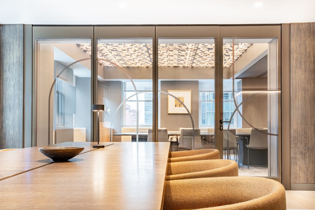
A meeting room lined with soft seating provides a relaxed space for informal meetings or recharging. It includes residential touches like sheepskin-upholstered chairs, Mongolian fur pillows, and zen-inspired mural wallpaper, all enhanced by soft uplighting to support staff comfort and well-being.
Sustainability Successes
It is often said that the most sustainable building is the one that already exists, and we embraced this principle in our design for the Chrysler Building office. Surrounded by the rise of new skyscrapers in Manhattan, we found inspiration in the history of the Chrysler Building, focusing on the inherent sustainability of preserving and updating historic structures. The Chrysler Building’s LEED Gold certification further highlights the balance between historic preservation and modern sustainability standards, showcasing how older buildings can meet today’s environmental goals.
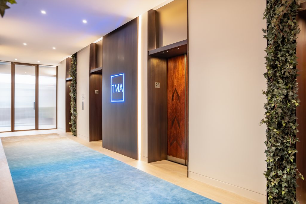
Throughout the project, we preserved many of the building’s iconic features. The intricate wood inlay elevator doors were highlighted to celebrate the building’s rich history, and we exposed the weathered concrete deck in the open studio area, creating a raw, authentic connection to the past. From the open studio, vistas of the building’s iconic stainless-steel ornaments offer a unique visual reminder of the intersection between history and innovation.
The materials used throughout the office were selected for their sustainability, including recycled, reclaimed or rapidly renewable materials for flooring, furniture, and finishes as well as low-VOC materials to improve indoor air quality.
The furnishings were chosen from manufacturers committed to eco-friendly and ethical production practices. Energy efficiency was another focus, with energy-efficient lighting and appliances incorporated throughout, alongside the strategic use of natural light to reduce energy consumption. To conserve water, we installed low-flow fixtures in restrooms and kitchen areas, further enhancing the overall sustainability of the office.
Branding Elements
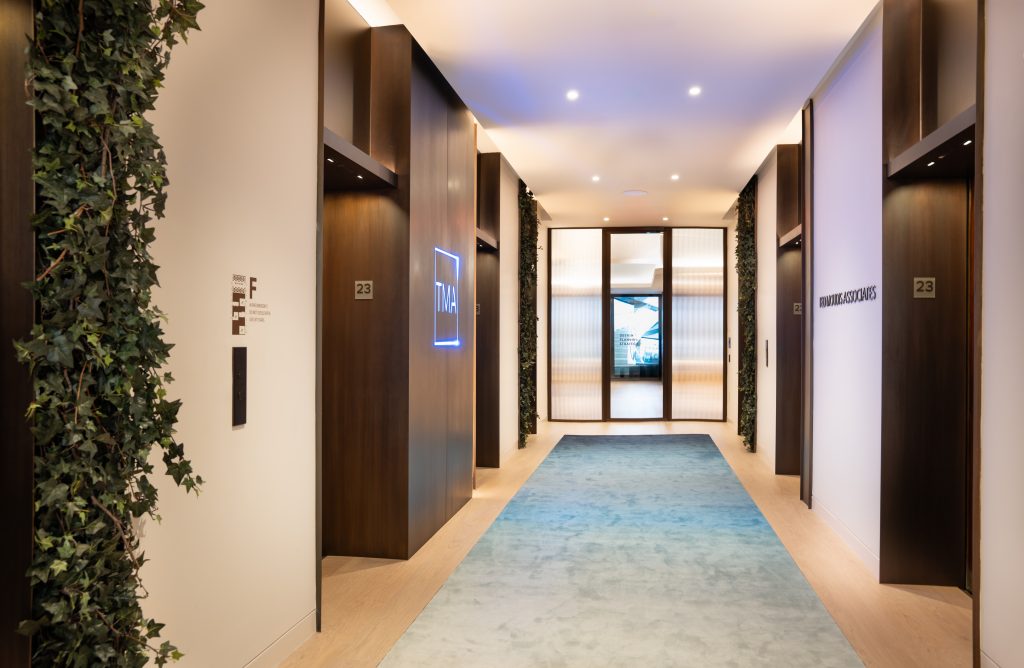
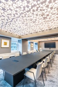
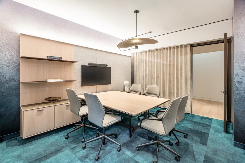
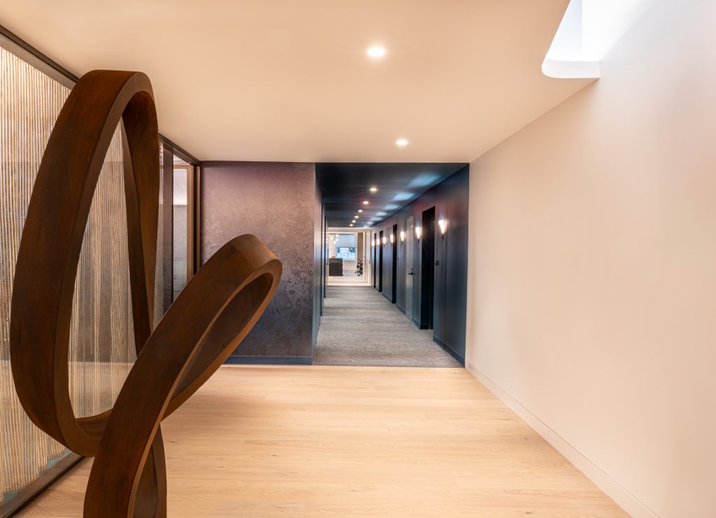
The color blue, central to TMA’s branding, is thoughtfully woven throughout the office design to create a cohesive identity. In the client conference rooms, blue is celebrated in various shades. The dark teal blue carpet sets the foundation, while matching wallpaper transitions from teal to ivory as it rises to the ceiling, creating a gradient that adds depth and a dynamic visual experience. In the corridor leading from the reception to the studio, deep blue tones envelop the walls, floors, and ceiling, creating a dramatic immersive experience. This bold use of blue serves as a visual marker, transitioning guests into the studio. The corridor’s blue wall peels back to reveal a light sconce, adding warmth and guiding visitors through the space.
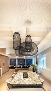
In the café and lounge, the booth seating features custom blue fabric panels printed with the skylines of New York and Chicago, representing the two locations of TMA’s offices. The area rug in the lounge has a light blue wash, further reinforcing the brand color in a subtle, elegant manner. Even the bookshelves in the café library are curated with books in “TMA blue,” serving as both a nod to the brand and a source of inspiration for staff and visitors.
In the studio itself, a custom pattern wallpaper that reflects TMA’s work and brand identity is subtly integrated. The tone-on-tone pattern includes glossy lines that echo architectural forms, with hidden details like the TMA logo, floor plans and design objects. This nuanced design ties the brand to the workspace in a refined and understated way, adding texture and sophistication without being overwhelming. This pattern reoccurs on the glass huddle rooms in a reduced scale in white that creates the sensation of drapery.
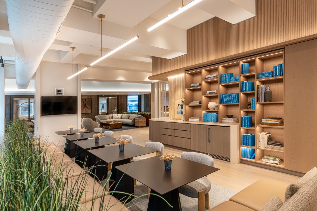
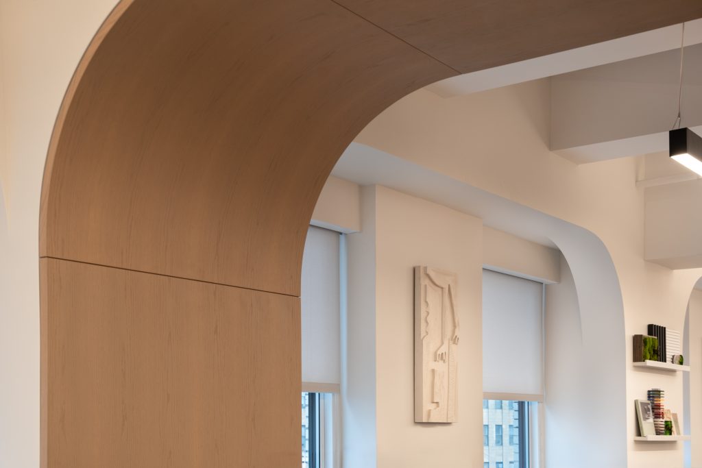
Other design elements honor the building’s art-deco history and connect TMA’s brand to the space. In the open studio, archways inspired by the Chrysler Building’s architectural style emphasize the connection between the firm’s identity and its iconic new home. The multipurpose room also features a pattern on the glass walls that abstractly recalls the curving forms of the Chrysler Building’s crown. These curves are echoed in the rusted steel artwork and planters that divide the reception area from the living room, referencing the industrial materials used in the building’s construction and tying them to TMA’s story.
The lounge introduces a personal touch, with olive trees in rusted steel planters referencing the Greek heritage of TMA’s founding principals. Rusted steel also appears in a sweeping sculpture, tying together the office’s overall aesthetic and the Chrysler Building’s machine-age era. The lounge and café are further curated with mid-century modern Danish ceramics and vintage objects from the 1930s, adding warmth, comfort, and a sense of hospitality to the space. A framed photograph of Margaret Bourke-White perched atop the Chrysler Building’s eagle gargoyle serves as a tribute to the building’s storied past, connecting TMA’s present with the legacy of its new home.
Most Unique Features of the Space
In our work booths, we mounted handwoven oriental rugs on the walls as a backdrop for the TV screens. This fresh, playful reimagining of a traditional material serves as a reminder of the power of small, innovative design choices. The rugs not only contribute to the acoustics of the booths but also create a cozy atmosphere, adding both definition and a distinct sense of place.
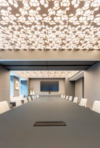
The multipurpose room features a nature-inspired Arktura backlit ceiling with a felt outer layer, giving the space an organic, calming quality. The ceiling creates a sensation of being under a canopy of trees, with light streaming through. The tunable lighting system allows us to adjust the color temperature, enabling us to showcase how different materials look under varying light conditions and to customize the ambiance for different events, social functions, and times of day.
Our bathrooms were designed to elevate the everyday experience for staff. Full-height wood laminate panels enclose the toilet stalls, while residential-style accessories were chosen over commercial alternatives. Handmade, textured blue ceramic tiles inside the stalls add a branded touch, along with convenient shelves for personal items like phones. The materials are warm and textured, with porcelain tiles resembling worn pebbles, ribbed porcelain imitating wood, soapstone counters with a leathered finish, and cement sinks. Backlit mirrors provide a soft glow while concealing paper towels, and bronze-tinted mirrors line the walls to further enhance the mood. The bathrooms are thoughtfully curated with sculptural consoles, flowers, books and art. Music plays through speakers upon entry, creating an immediate sense of relaxation. The overall intent was to craft a spa-like atmosphere that feels welcoming, luxurious and serene.
Impactful Products
Tech Solutions
- High-Performance Workstations Laptops: Lenovo P1 Workstation, Dell Precision 3590 equipped with the latest Intel Core i9 processors and NVIDIA graphic card for design and rendering tasks.
- Ergonomic Monitors: Dual 27-inch Dell/Samsung 4K monitors for each workstation to enhance productivity and reduce eye strain.
- Smart Conference Rooms: Outfitted with Poly X50 video conferencing systems, and wireless presentation solutions.
- Internet of Thing Devices: Smart Lutron lighting, climate control, and occupancy sensors to optimize energy usage and comfort.
- High-Speed Networking: Enterprise-Cisco routers and switches to ensure fast and reliable connectivity.
An Experiential Design
At TMA, we sought to create an office environment that transcends the ordinary, focusing on an experiential design where every detail is thoughtfully considered. Our goal was to craft a space that not only serves functional needs but also immerses both staff and clients in a holistic and meaningful experience. By paying attention to even the smallest elements, we aimed to evoke a sense of warmth, comfort and hospitality from the moment someone steps into our space. This philosophy of experiential design—where every detail contributes to the overall atmosphere—shapes the way we approach both our work and our own office environment.
From the moment a client steps off the elevator, they are greeted by soft, warm lighting, the sound of gentle music, and the visual softness of green ivy on the walls. The plush rug underfoot adds to the welcoming feeling. Upon entering the reception area, clients are offered a cappuccino served in a china mug with art deco accents. The napkin, placed in a holder adorned with sculpted olive branches, subtly references the Greek heritage of our founding principals. As they sit near windows dressed with ivory drapery, clients can enjoy a large-scale video display showcasing the firm’s work, fully immersed in a thoughtfully curated setting.
We replaced disposable water bottles with sculptural blue water pitchers inspired by Greek urns, complemented by fluted drinking glasses, organically shaped marble trays, and burl wood ice buckets. Each piece was selected to reflect the architectural design of the space and contribute to a cohesive, ‘lifestyle’ experience. Even the staff’s coffee mugs were chosen for their tactile, fluted design, ensuring every item enhances the sensory experience.
Overall Project Results
Our internal workplace strategy team implemented an in-depth change management program to generate excitement and ensure a smooth transition into our new office space. This project was particularly unique because it involved a personal element—the employees we were developing the content for were not just coworkers but also friends. The close relationships among our colleagues enhanced communication about the move, making the process feel more collaborative and supportive.
To ensure all staff were engaged, we involved the entire team throughout the process. We hosted monthly check-ins with nominated “Change Champions” from each studio and bi-monthly meetings with Studio leaders. To further ensure that everyone’s voice was heard, we collected anonymous feedback through a series of pulse-check surveys, allowing employees to express concerns or ideas openly.
We also made the process interactive and enjoyable. In collaboration with our furniture team, we organized a “chair fair” where all employees could vote on their preferred desk chairs. We also built a foam-core mockup of the new workstation and storage layout so colleagues could physically experience the new open work area and provide feedback on its design.
As the project neared completion, we organized site tours of the new office space. These tours allowed staff to see the new environment before the first working day, reducing any apprehension about the move. This final engagement helped build excitement and ease concerns as moving day approached, contributing to a successful transition.
Meet Ted Moudis
Follow Ted Moudis on Instagram
Follow Ted Moudis on Linkedin
Photography
Courtesy of Ted Moudis
Want More From Ted Moudis Thought Leaders?
More Than a Coffee Break: Intentional Café Spaces That Enhance Community

